The title is a play on words from another existing game, but the idea, greyboxing, worldbuilding, and scripting is 100% mine. :P This was made for the CGMA Level Design course with Shane Canning. I had an absolute blast learning from Shane. Scripting and worldbuilding various types of levels. This level design blockout in particular was one of my favorites so I had to share it on my blog.
Hunter Prop WIP - Fishing Spear / Harpoon
WoW Fan Remake: Process on creating a concept for 3D
So I'm starting another WoW remake after finishing my last 3D prop (WoW Undercity Mailbox), and it's going to be a big one!
References
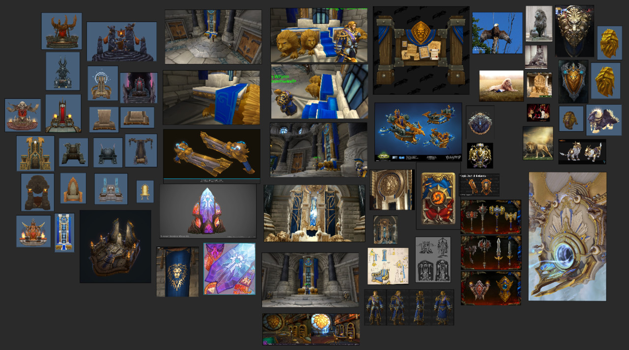
I wanted some style references to help me design the throne. Usually when you think of World of Warcraft, you think... curves, exaggeration, bold shapes. Ok, but what about royal props in WoW? Are they still just as exaggerated and curvy? I looked thru a model viewer and searched for all the thrones in WoW. Alot of slants in the chair and straight lines! There is still exaggeration in them, but not super cartoony.
Next I looked for Stormwind's culture design. What designs do they use in the banners? On Anduin's clothes? Looks like lions and eagles are a common symbol choice for accessories.
And last but not least, what the heck should an updated lion statue look like? I want to keep it stylized but a little more regal.
So all these questions I tried to answer by finding corresponding art, photos, and screenshots.
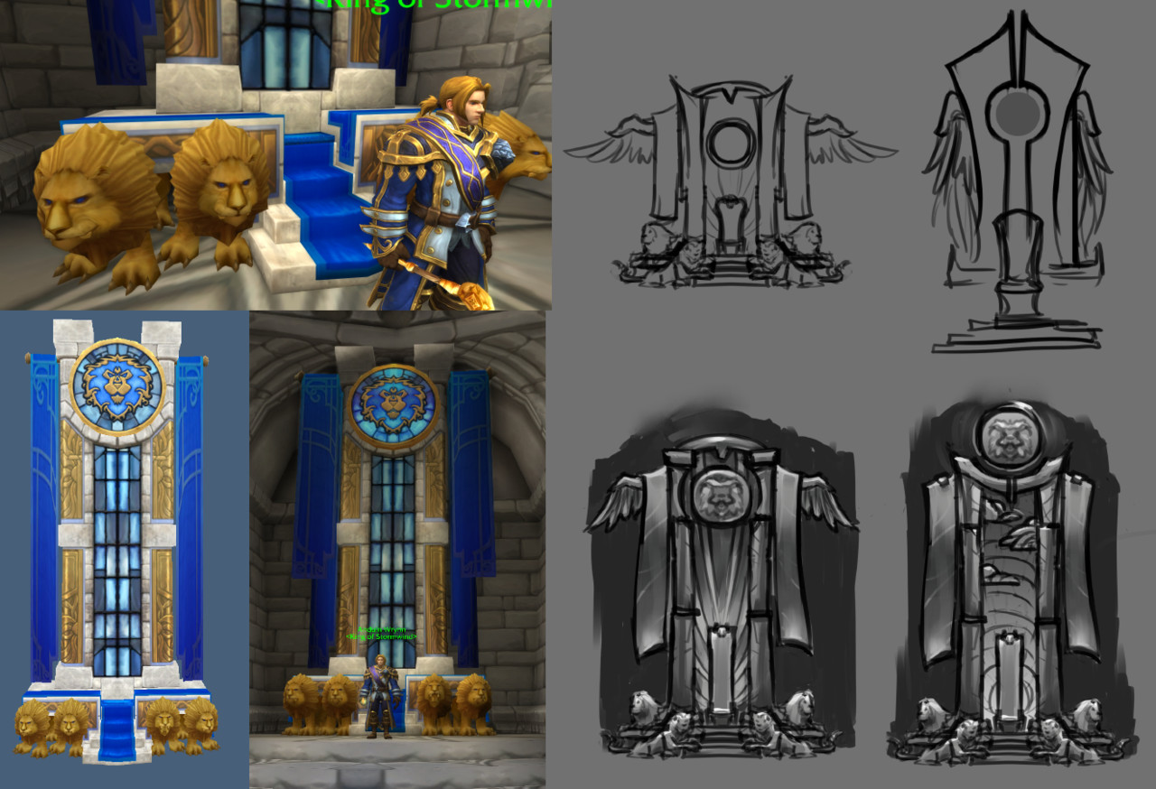
Thumbnails
I first started small with thumbnails. Get the overall feeling and shape of the throne. Even though I liked the idea of wings, I chose to not add it on the last one just to see what it would look like. I wanted to get as much variety as possible in each one, so that I can kitbash certain elements into my concept.
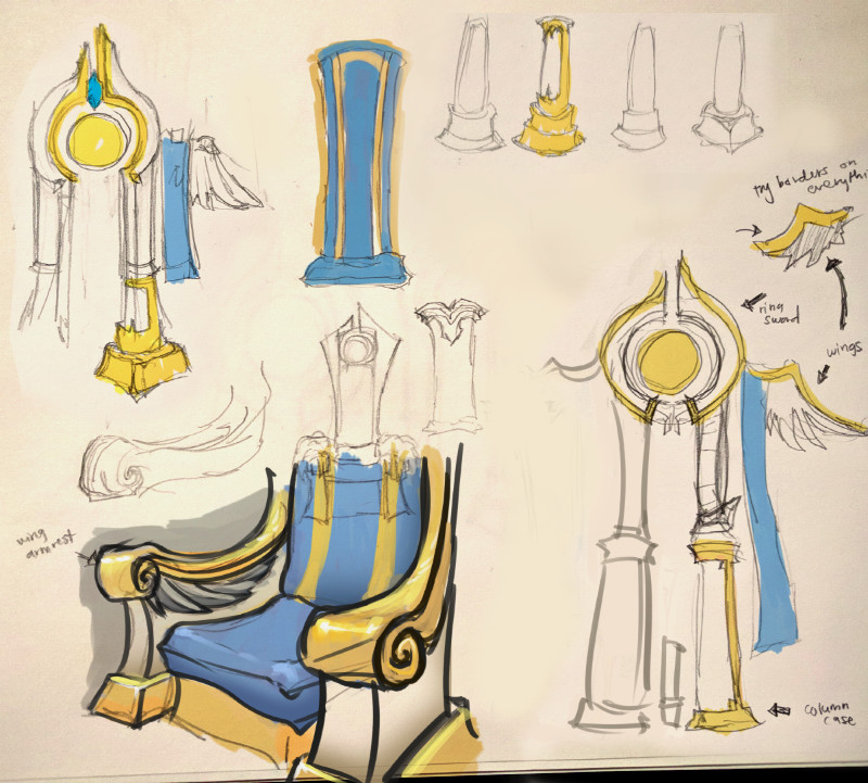
Sketches
I wanted to sketch medium level details on things that I knew would take up alot of screen space or would be the main focus [of the player] or [for beauty shots]. I want to have JUST ENOUGH detail for me to confidently start modeling. So if I think a design may end up changing the contour of the prop, I put that in and decide if I want to keep it. Do I want to add trim? How thick will it be? Can I /quickly/ find out if that will look good before i put time into modeling it?
I don't stress it though. I know changes will happen throughout the process. I guess, what is important is:
- DO NOT work until you feel 100% happy with the design.
- DO work quickly by answering obvious questions you have in your head at that moment. (Thick or thin columns? Sketch it really quick. Winged chair or not? QUICK SKETCH.) Doesn't have to be pretty or polished.
Concept
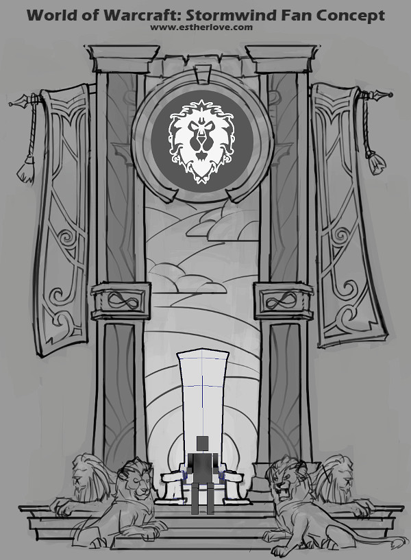
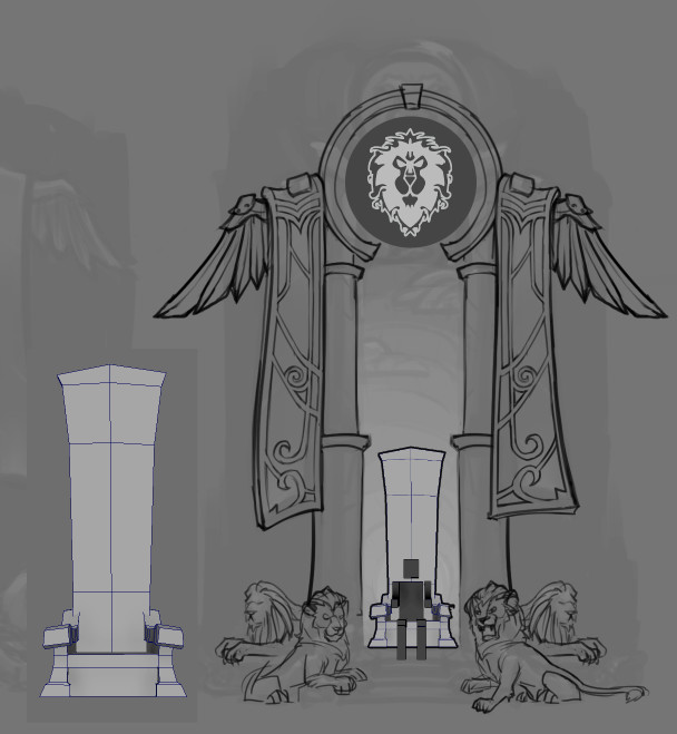
I resized the thumbnail and began to draw over it. Added medium details that I sketched out previously or felt like adding at this stage (ex. Lion expressions) Figuring out the design on banner was also important, because I knew I would have some kind of artistic panic if I had a beautifully blank banner model and didn't know what to do put on it! I don't really like "sketching" on model, so I always either do a 2D paintover in Photoshop or sketch ideas on paper. In this case, I chose to sketch in Photoshop.
As for the chair, I was having trouble drawing the chair that particular evening..... so I didn't want to waste any more time and just modeled it out. The general shape was good, it satisfied my need of a chair, and I already sketched up medium details for it earlier. SO I MOVED ON!
From here I chose to remove the wings and turn the round columns into block columns. I was getting feedback that it looked too priest-y and not enough ALLIANCE. Alliance represents strength thru order. So I wanted my columns to feel strong and be made of one whole chunk of stone. You can view the 'final' concept at the top of the blog. I will add color once I get into the texture phase and need those questions answered.
End
That's it for the concept! It works well enough for me to start modeling. As I get further into the modeling phase, I'll start to think about story elements that I can add into the texture or as smaller props. Updates on this will most likely happen after New Years since I'll be away with family (with no computer...eep!)
Let me know what you think and if this was helpful!
Painting on a sketch I made last night!
A concept I created for myself to practice stylized design &...


A concept I created for myself to practice stylized design & color. I wanted to take a pre-existing game asset and give it the star treatment. It was fun to study World of Warcraft’s design aesthetic and add to it! By doing this it helps to improve my overall texturing skill for whenever I work on 3D props. David Harrington (https://www.artstation.com/artist/davidharrington) was a big inspiration on this particular piece. I also plan to create this as a 3D handpainted prop soon.
P.S. Can you spot the intrigue?
This is a 2D master painting of a prop that Ashleigh Warner made...

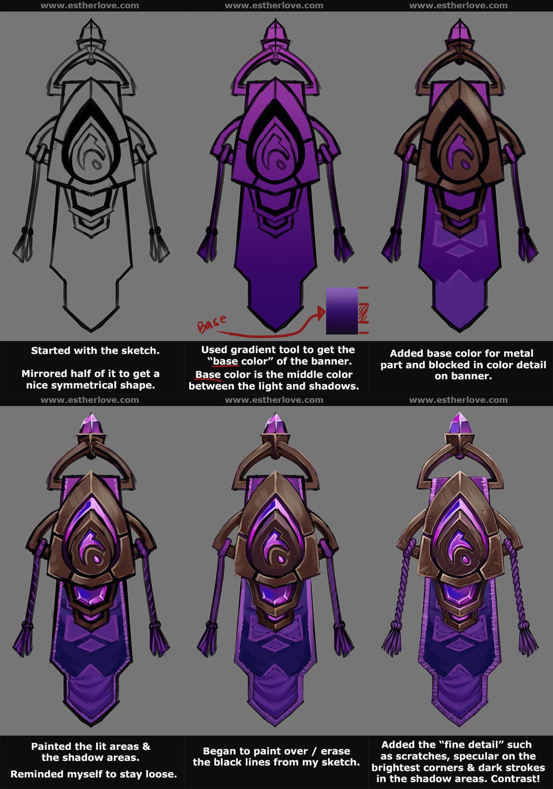
This is a 2D master painting of a prop that Ashleigh Warner made for World of Warcraft. You can find the original here: https://www.artstation.com/artwork/g2R4L
No tracing or color picking involved. Strictly observation.
I enjoy making studies off of the things I see in World of Warcraft. It helps to inform my texturing process when I do 3D props. Its similar to how painters would create master paintings from classical paintings to understand how the original painter made their brush strokes & etc. Doing studies like this has helped me get this far, and I want to continue doing it. ^^


